
SA Rugby: Springboks Identity refresh
Slides 1–4
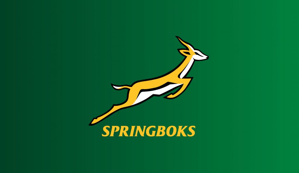
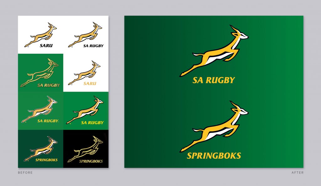
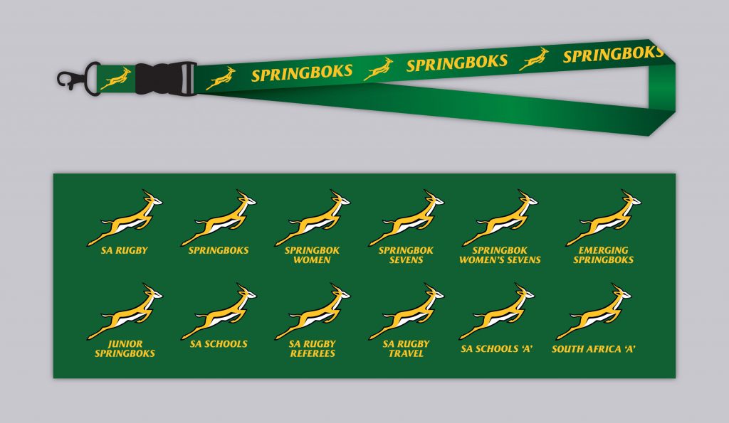
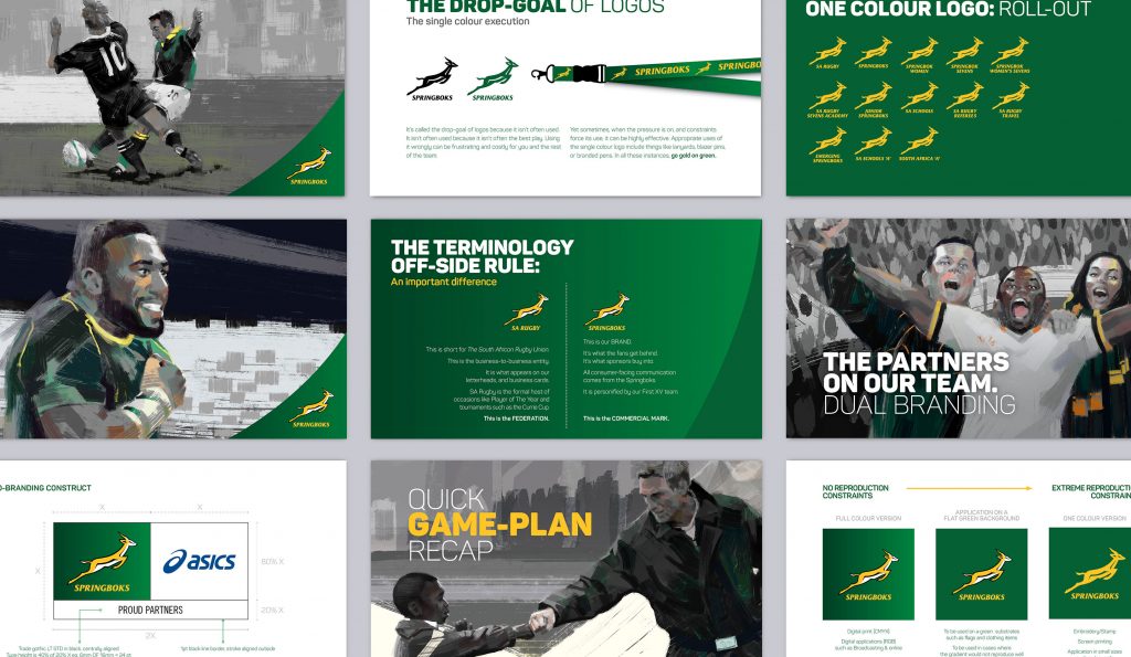
At the time of briefing, a number of variations of this iconic logo were in circulation. Multiple issues including; keyline outlines, hairlines in the visual structure and multiple colours made the logo difficult to re-produce. We gave this billion Dollar brand a sleek makeover, and the polish it deserved.
Tiger Brands: Energade packaging redesign
Slides 5–7
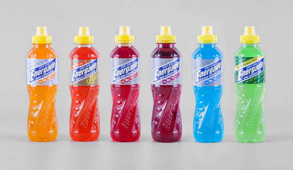
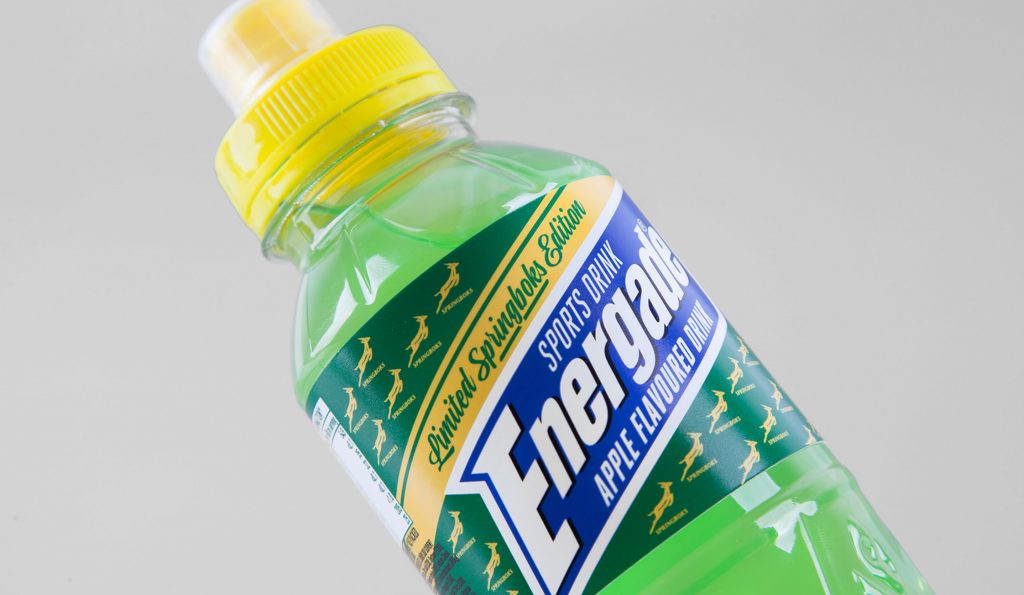
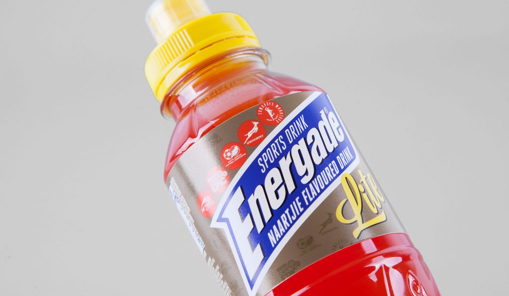
Energade is a premier player in the sports refreshment category. They had a redesigned bottle, and were looking for a re-designed logo and label. A number of iterations of logos, and explorations of labels were pressure-tested. Here’s where we netted out.
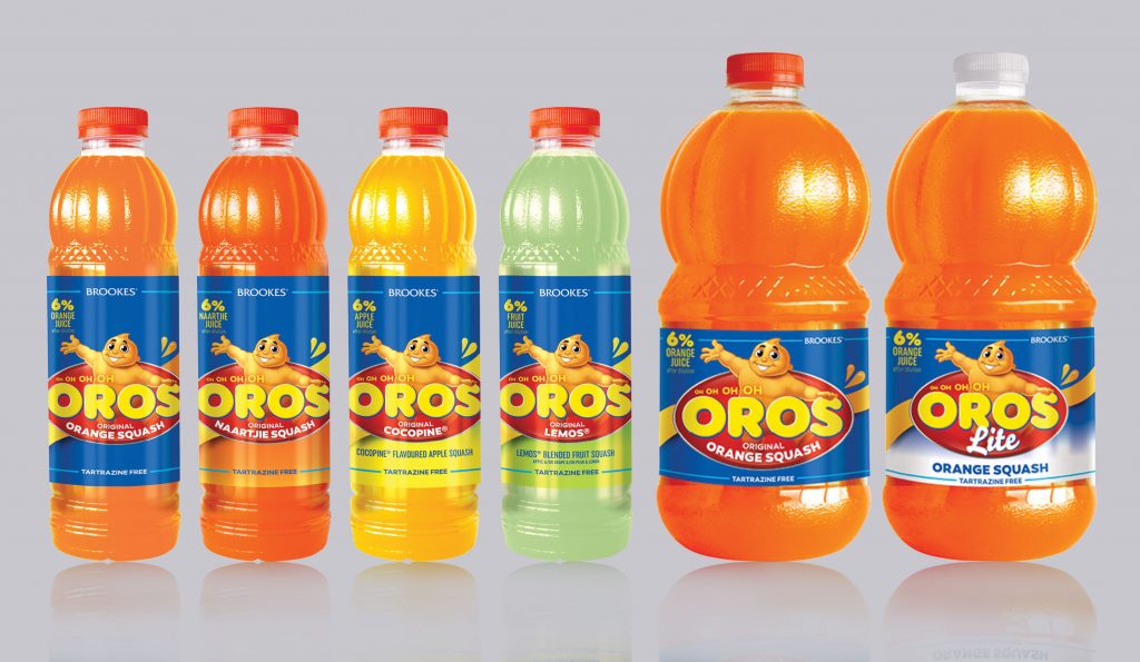
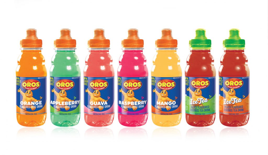
Tiger Brands: Oros packaging redesign
Slides 8–10
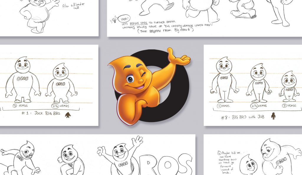
The original brand had become a victim of its own success. The Oros logo and label was being copied by all its competitors. Our execution refreshed the logo, and the iconic Oros Man – and most importantly carried enough brand forwards while differentiating for the competitors.
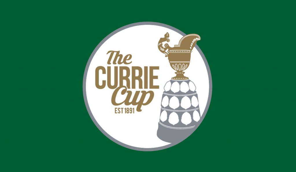
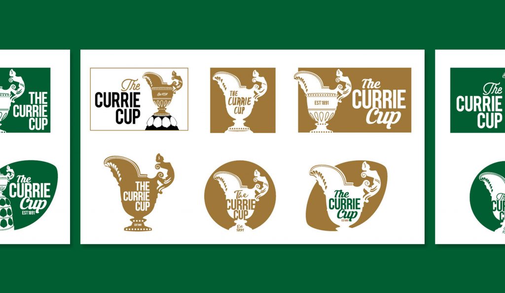
SA Rugby: Currie Cup Identity redesign
Slides 11–12
When it comes to SA rugby in South Africa, the Currie Cup is an institution. Being the oldest competition of its kind in the world means that there is a tremendous amount of history to stay true to. Our solution pulls the tournament into ‘the now’, while staying true to its heritage.
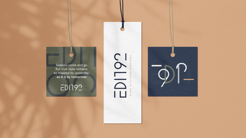
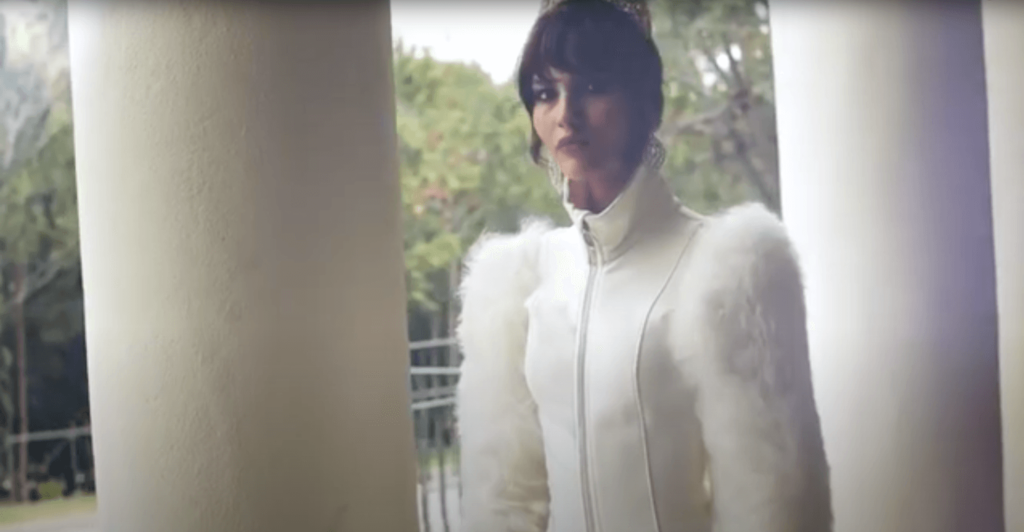
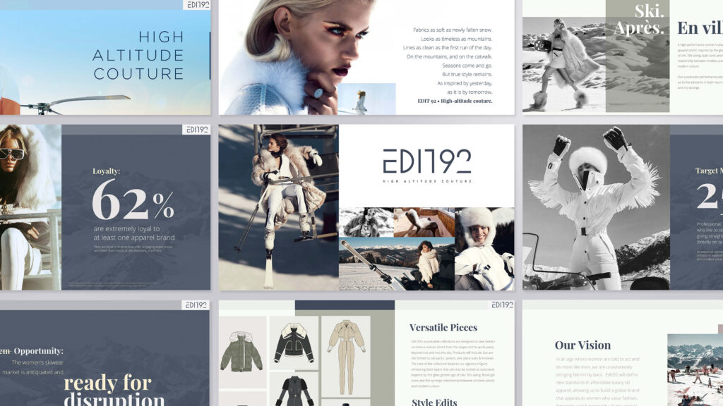
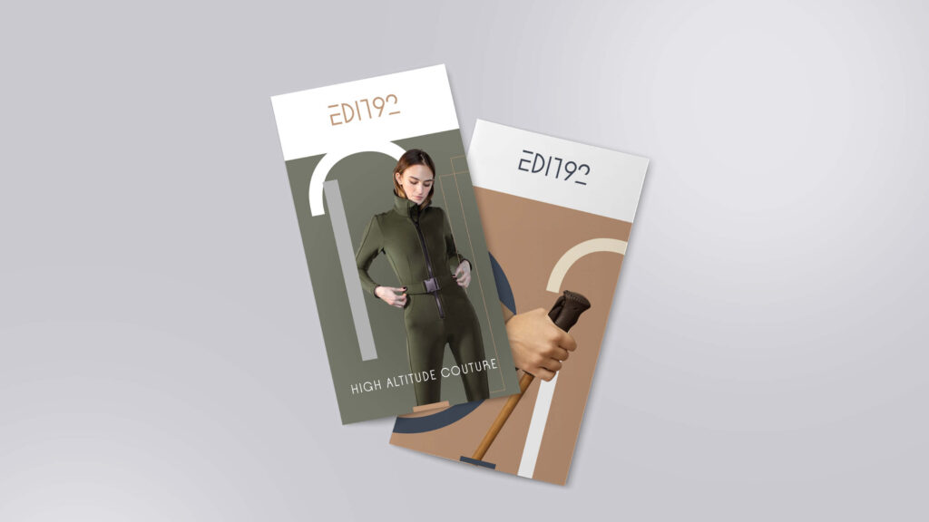
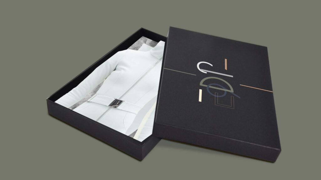
Edit92: Corporate identity design & brand positioning
Slides 13-16
High fashion chic in in high altitude climes. Edit92 needed a look and brand positioning that fused 60’s Bond-girl suave with contemporary fashion. And we achieved just that. A look that’s effortless, timeless and iconic. Long live high-altitude couture! *clinks Champagne flutes*
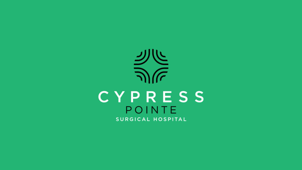
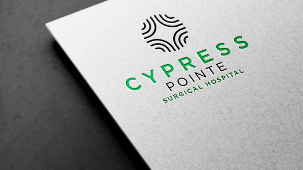
Cypress Pointe: Corporate identity redesign
Slides 17-20
Cypress Pointe hospital’s identity was afflicted with a number of ills. It was difficult to use in signage, on scrubs and really any printed material. It also felt dated, and didn’t capture the hospital’s forward-facing leadership. The redesign breathed new life into the brand, and helped align all internal teams around the vision for the future.